ext_12928 (![[identity profile]](https://www.dreamwidth.org/img/silk/identity/openid.png) dreamoflight.livejournal.com) wrote in
dreamoflight.livejournal.com) wrote in ![[community profile]](https://www.dreamwidth.org/img/silk/identity/community.png) twindrives2010-09-23 08:29 pm
twindrives2010-09-23 08:29 pm
(no subject)
AND NOW, FOR SOMETHING COMPLETELY DIFFERENT
Some friends had been asking me how I do my manga colorings, and I have just enough time on my hands to oblige. So under the cut, you'll find a very image-heavy tutorial on how to go from this to this.
First step! Get the manga picture you want to color. You don't have to crop too carefully or anything yet.

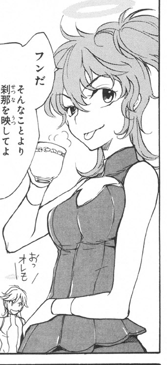
The first thing to do is make those black areas, like her eyes, proper black.


Use the Levels command, and drag the left slider over until the black parts are dark. (If you go too far, your image will get ugly. I usually aim for the middle of the first bump.)
The next step can be very annoying and time-consuming, but I find it works best for this style: erasing the screentones.
Now, depending on the particular manga, this can be easier or harder. I used the magic wand tool to select the tones in Nena's hair... except the grain was too large so it didn't work that well, and the selection was patchy. I expanded by one pixel (in the select menu) and that took care of most of it.

Then, and this is important, contract by one pixel. This will prevent the eraser from eating away at the lines you want to keep too much. I erased inside the selection...

...and was left with something a little ugly. Just go over with the eraser once or twice more and that'll clean it right up.

If there are some flecks left after that, just erase them after deselecting. I have a tablet, so for those fiddly bits in her hair, I just used the pen rather than selecting all of them individually; mouse users might find it handy to keep using the select tool.

There's the lineart after erasing all the screentone. I left that bit of shading under her neck to remind me of how to color later, and erased the halo because I don't intend on coloring it. Notice that the lines look a little weird now; if there's any obvious jaggedness you can smooth it out, but overall, don't worry about it-- it'll look better after coloring, because the next step is to set the lineart layer to multiply.
Make a new layer under it, and start blocking in solid color.

Aim for something around the middle of the color range you're going for, but honestly it's not that important. I color in things bright green to start with sometimes if I want to make sure it's totally filled in.

You can use as many layers as you feel comfortable with; I usually do one per color, but some people do two or three colors per layer. Just don't have different colors touching each other on one layer and you're good. (Notice I haven't colored the eyes yet, we're doing those later.
And now: coloring! We'll start with the skin.

For the shadow color you want something more saturated and redder; for the highlight color, less saturated and yellower.

Lock the transparency of the skin layer, and do a lasso selection around the face/neck area.

And now, my secret weapon... gradients. Make sure the lighter color is in front, and select the circle pattern...

And put a gradient on the face. Generally the highlight will center on one cheek or another, depending on the light direction, but play around until you get something you like.
The face isn't a smooth ball, so you've got to do some extra shading. For tablet users turn on pressure sensitivity, and for mouse users make use of the smudge tool. Lower your opacity no matter what you're using; I vary between 30-50% depending on how bright I want my result.

Here's a diagram of where I put highlights and shadows when the light comes from this angle. Highlight the eyelids, the browbone, the nose, and the bottom lip, and extend the cheek highlight to the nose; shadows go under the nose, on the top lip, a bit under the eyes, under the neck, and anywhere anything such as hair would cast a shadow. At this point I erase the lineart shading under her chin. You can add a little pink or red to the lips if you like; I didn't here because I'm not very good at it.
Next is something called reflective lighting. Basically, things are generally roundish and have a bit of light bouncing off even the shadows. There are better tutorials than mine if you want the details of why that happens, but all you need to know for this tutorial is to raise your opacity back to 100%...

...and draw lines of the brightest color along the shadowed edges.
Now for the eyes! Erase the lineart shading if you like; I did here, because there was a lot of black and I like to color. Take your base eye color and paint it in the irises on a new level.


Using gradually darker colors, paint in shapes like this-- darker at the top.

Draw in the pupil with a shade near to black, giving them crazy eyes.

To get rid of crazy eyes, use the burn tool! I used a combination of the midtone and shadow settings here to burn the pupil and top shading black.

Depending on preference, use lighter colors and the dodge tool on midtone/highlight to lighten up the bottom of the irises.

And then use white to draw in small highlights over it all.

Progress shot! Also, something else I did: took a pinky-gray on a low opacity and went around the top and bottom of the eye. This usually works better with smaller eyes, so I didn't really work too hard at it here.

Do the rest of the skin the same way as the face, keeping in mind where your light source is. You can either use the circle or bar gradient for arms (and legs) depending on how toned the character is.

Time for hair! Pick a bright desaturated color for the highlights, and a darker saturated color for the shadows. For me, the highlight is more orange, and the shadow is a truer red. Use the gradiant tool on bar setting to start off with.


Use the magic wand tool to draw out the highlights, then either use the fill bucket or gradients again to color them. Everyone colors hair differently, so I'm not going into too much detail on this part.

Do your shadows the same way. If you like, you can use the dodge tool to brighten the highlights; I just drew a thin highlight in a whiter shade.

Color the clothes on the same principle as the skin-- use the circle gradient tool to start off with...

And then shade the same way as the hair, with the magic wand tool. I don't actually like shading clothing very much most of the time, and it usually isn't the focus of icons anyway, so I don't spend much time on it. Notice the reflective lighting again!

Last step right now is to color the cup. I made it pink, because I like pink. Use the dodge/burn tools for a metallic effect, like I did on the gold.
And then icon or banner it the way you like best. :>
This is the first tutorial I've written ever, so let me know if you have questions about any massively confusing bits!
Some friends had been asking me how I do my manga colorings, and I have just enough time on my hands to oblige. So under the cut, you'll find a very image-heavy tutorial on how to go from this to this.
First step! Get the manga picture you want to color. You don't have to crop too carefully or anything yet.
The first thing to do is make those black areas, like her eyes, proper black.
Use the Levels command, and drag the left slider over until the black parts are dark. (If you go too far, your image will get ugly. I usually aim for the middle of the first bump.)
The next step can be very annoying and time-consuming, but I find it works best for this style: erasing the screentones.
Now, depending on the particular manga, this can be easier or harder. I used the magic wand tool to select the tones in Nena's hair... except the grain was too large so it didn't work that well, and the selection was patchy. I expanded by one pixel (in the select menu) and that took care of most of it.
Then, and this is important, contract by one pixel. This will prevent the eraser from eating away at the lines you want to keep too much. I erased inside the selection...
...and was left with something a little ugly. Just go over with the eraser once or twice more and that'll clean it right up.
If there are some flecks left after that, just erase them after deselecting. I have a tablet, so for those fiddly bits in her hair, I just used the pen rather than selecting all of them individually; mouse users might find it handy to keep using the select tool.
There's the lineart after erasing all the screentone. I left that bit of shading under her neck to remind me of how to color later, and erased the halo because I don't intend on coloring it. Notice that the lines look a little weird now; if there's any obvious jaggedness you can smooth it out, but overall, don't worry about it-- it'll look better after coloring, because the next step is to set the lineart layer to multiply.
Make a new layer under it, and start blocking in solid color.
Aim for something around the middle of the color range you're going for, but honestly it's not that important. I color in things bright green to start with sometimes if I want to make sure it's totally filled in.
You can use as many layers as you feel comfortable with; I usually do one per color, but some people do two or three colors per layer. Just don't have different colors touching each other on one layer and you're good. (Notice I haven't colored the eyes yet, we're doing those later.
And now: coloring! We'll start with the skin.
For the shadow color you want something more saturated and redder; for the highlight color, less saturated and yellower.
Lock the transparency of the skin layer, and do a lasso selection around the face/neck area.
And now, my secret weapon... gradients. Make sure the lighter color is in front, and select the circle pattern...
And put a gradient on the face. Generally the highlight will center on one cheek or another, depending on the light direction, but play around until you get something you like.
The face isn't a smooth ball, so you've got to do some extra shading. For tablet users turn on pressure sensitivity, and for mouse users make use of the smudge tool. Lower your opacity no matter what you're using; I vary between 30-50% depending on how bright I want my result.
Here's a diagram of where I put highlights and shadows when the light comes from this angle. Highlight the eyelids, the browbone, the nose, and the bottom lip, and extend the cheek highlight to the nose; shadows go under the nose, on the top lip, a bit under the eyes, under the neck, and anywhere anything such as hair would cast a shadow. At this point I erase the lineart shading under her chin. You can add a little pink or red to the lips if you like; I didn't here because I'm not very good at it.
Next is something called reflective lighting. Basically, things are generally roundish and have a bit of light bouncing off even the shadows. There are better tutorials than mine if you want the details of why that happens, but all you need to know for this tutorial is to raise your opacity back to 100%...
...and draw lines of the brightest color along the shadowed edges.
Now for the eyes! Erase the lineart shading if you like; I did here, because there was a lot of black and I like to color. Take your base eye color and paint it in the irises on a new level.
Using gradually darker colors, paint in shapes like this-- darker at the top.
Draw in the pupil with a shade near to black, giving them crazy eyes.
To get rid of crazy eyes, use the burn tool! I used a combination of the midtone and shadow settings here to burn the pupil and top shading black.
Depending on preference, use lighter colors and the dodge tool on midtone/highlight to lighten up the bottom of the irises.
And then use white to draw in small highlights over it all.
Progress shot! Also, something else I did: took a pinky-gray on a low opacity and went around the top and bottom of the eye. This usually works better with smaller eyes, so I didn't really work too hard at it here.
Do the rest of the skin the same way as the face, keeping in mind where your light source is. You can either use the circle or bar gradient for arms (and legs) depending on how toned the character is.
Time for hair! Pick a bright desaturated color for the highlights, and a darker saturated color for the shadows. For me, the highlight is more orange, and the shadow is a truer red. Use the gradiant tool on bar setting to start off with.
Use the magic wand tool to draw out the highlights, then either use the fill bucket or gradients again to color them. Everyone colors hair differently, so I'm not going into too much detail on this part.
Do your shadows the same way. If you like, you can use the dodge tool to brighten the highlights; I just drew a thin highlight in a whiter shade.
Color the clothes on the same principle as the skin-- use the circle gradient tool to start off with...
And then shade the same way as the hair, with the magic wand tool. I don't actually like shading clothing very much most of the time, and it usually isn't the focus of icons anyway, so I don't spend much time on it. Notice the reflective lighting again!
Last step right now is to color the cup. I made it pink, because I like pink. Use the dodge/burn tools for a metallic effect, like I did on the gold.
And then icon or banner it the way you like best. :>
This is the first tutorial I've written ever, so let me know if you have questions about any massively confusing bits!
no subject
no subject
...Also, because I massively fail metallic forever mind going over how to dodge/burn it to make it actually look properly metallic? >3>
no subject
1. Base color
2. Use burn on the shadow setting to darken the shadows; I did it down both sides, leaving the middle brighter. Ideally. You can't see it that well.
3. Use dodge on the highlight setting to draw a bright highlight. I think I had it at around 30%. Basically if you dodge and then have to put on sunglasses, try it again at a lower strength.
4. I built up both the shadows and the highlight, using both dodge and burn on midtone setting. (Basically, for burn, shadow gives you the most saturated burn. For dodge, it's highlight. That's good for the darkest and lightest parts, but midtones is more desaturated and realistic looking.)
5. I ran a bright streak down the highlight with the paintbrush, and did that reflective lighting thing on the deepest shadow.
Hopefully that helps :'>;;